User Research
User research is important to understand users, their needs, their pain points. It helps me to go in a correct direction for redesigning this project.
Rahul
Student
Sometimes finds it boring to navigate through the whole premium purchasing process
Would love to have an easy way to go to the premium page.

Travel enthusiast
He feels like the website should have more green to it.

Arjun
He feels like he has entered some fake website.
Designer
She does not like too many colors used on the website.
She thinks that the website needs an update

Samiksha
Journey mapping
I tried to define the journey of a potential user through the website. His expectations and areas of improvement.
Rahul
Student
Scenario
Rahul visits the website every 3 months. He sometimes finds it difficult to navigate his way through the website. He would love if navigation was made easy specifically for goring to the premium page.


Visit
Pain Points
Pain Points
Premium
Compare
Brand identity not visible.
No easy way to go to premium
Brand identity not visible.
Blue make it look like the website is some fake one
Compare all the plans that Spotify provides.
Select
Selecting the most favorable plan and purchasing premium.
Roadmap
On the basis of research I figured out a roadmap of the users. I tried to simplify as much as I could.
Journey from home page to purchasing premium
Roadmap 2
Entering the website
Navigating to the premium option
Choosing the perfect plan and making payments
Journey from home page to downloading Spotify
Roadmap 1
Entering the website
Navigating to the download option
Clicking on the download button
Design elements
I have changed some design elements of the website to make it look more modern, minimal and user-friendly.
Design elements
A limited use gradient elements makes the design look beautiful, modern and elegant.
Rounded corners give the design more minimal and modern feel.
Circular Std is the official font for Spotify. This typeface is very modern and minimalistic.
Typography
Rounded corners
Green
#1ED760
White
#FFFFFF
Black
#1B1B1B
Green, white and black are the official colors of the Spotify brand. These hues are accessible and legible
Color palette
Gradient element
Book
Medium
Bold
Black
Circular Std
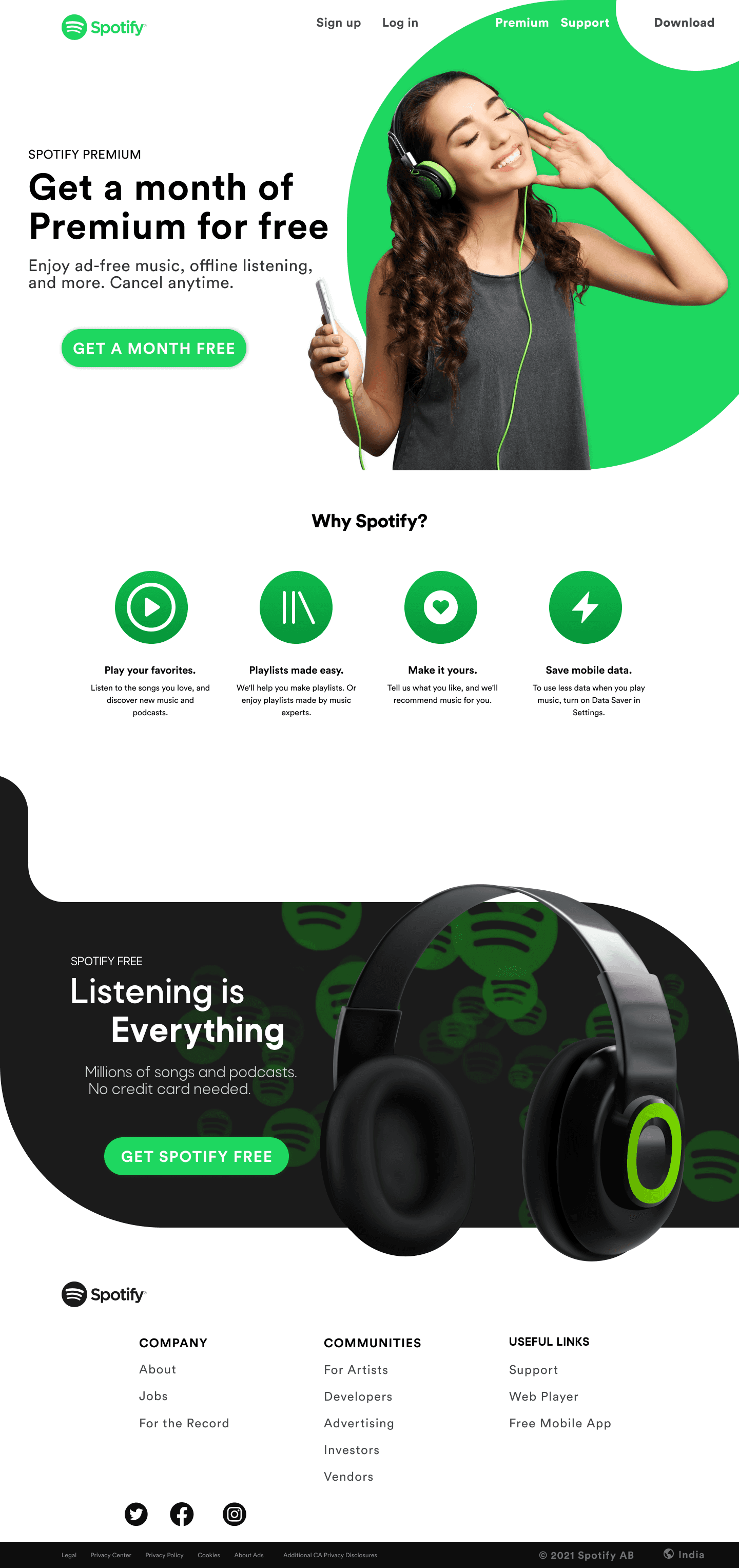
Interface with experience
These are the end result screen where UI meet UX. I wanted to reflect the brand identity of Spotify, so the users don’t get confused.
Hi Fi Wireframe
Added an ad for purchasing premium
Changed the colors to match their brand identity
Increased the size for better readability
Changes the header in such a way that it attracts more attention
Made an ad for downloading Spotify
Navigate you way throughout the site
Home
Buy premium for spotify
Premium
Get help for your problems
Support
Download and enjoy Spotify
Download
Very simple onboarding experience
Sign in
Log in to your account
Log in
Conclusion
The long process of researching, testing, and repeatedly honing my designs has led to a project I’m proud of, but still, I believe there’s a lot of room for improvement.
It's good to ask for lots of help! Having a fresh pair of eyes helped a lot with nitpicking details I glazed over
Test the final prototype with more users and make adjustments for improvement
Can help challenge the assumptions I made in my design
WHAT I LEARNED
SOME THINGS I WOULD DO DIFFERENTLY...
Solution
Redesigning the website such that it resembles the brand identity of Spotify.
02 Redesigning of home page.
What’s the cure
01 Use of brand signature colors.
Problems
After gathering data from online surveys and observation. I identified some basic element/features of the website to improve upon.
What’s wrong?
01 Use of too many colors.
02 Brand identity not visible.
03 Home page
Introduction
Spotify is one of the most popular music streaming platform that offers more than 30 million songs and has generated over 100 million active users on both desktop and mobile versions of their product.
Despite its immense success and huge user base, certain design features/elements of the website can be updated for the user to have a seamless experience
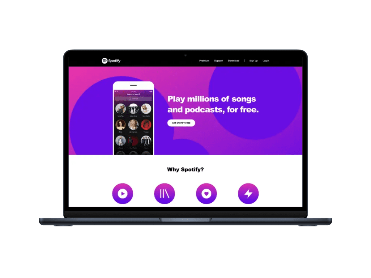
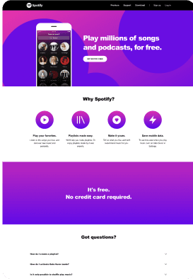
*Original
Making Spotify more musical.
Enhancing the User Experience Of the Spotify website.
Redesign, UI/UX

Timeline
October 2023
( < 1 Week )
Design Role
UI/UX Designer
Team
Individual
Wireframe
Lo Fi wireframes allow me to put my ideas into action and further develop them into Hi Fi wireframes. I try to visually represent the data gathered in research phase.
Lo Fi Wireframes
Main Page
Premium
Support

Research
Finding opportunity
To determine that the spotify website really needed a new look, i conducted some interviews to better understand the problems they were facing with the website.
Findings
All interviewees emphasized on the website not looking like spotify.
Contrary to my expectations, they were not intimidated by two many premium options.
User Research
User research is important to understand users, their needs, their pain points. It helps me to go in a correct direction for redesigning this project.
Rahul
Student
Sometimes finds it boring to navigate through the whole premium purchasing process
Would love to have an easy way to go to the premium page.

Travel enthusiast
He feels like the website should have more green to it.

Arjun
He feels like he has entered some fake website.
Designer
She does not like too many colors used on the website.
She thinks that the website needs an update

Samiksha
Journey mapping
I tried to define the journey of a potential user through the website. His expectations and areas of improvement.
Rahul
Student
Scenario
Rahul visits the website every 3 months. He sometimes finds it difficult to navigate his way through the website. He would love if navigation was made easy specifically for goring to the premium page.


Visit
Pain Points
Pain Points
Premium
Compare
Brand identity not visible.
No easy way to go to premium
Brand identity not visible.
Blue make it look like the website is some fake one
Compare all the plans that Spotify provides.
Select
Selecting the most favorable plan and purchasing premium.
Roadmap
On the basis of research I figured out a roadmap of the users. I tried to simplify as much as I could.
Journey from home page to purchasing premium
Roadmap 2
Entering the website
Navigating to the premium option
Choosing the perfect plan and making payments
Journey from home page to downloading Spotify
Roadmap 1
Entering the website
Navigating to the download option
Clicking on the download button
Design elements
I have changed some design elements of the website to make it look more modern, minimal and user-friendly.
Design elements
A limited use gradient elements makes the design look beautiful, modern and elegant.
Rounded corners give the design more minimal and modern feel.
Circular Std is the official font for Spotify. This typeface is very modern and minimalistic.
Typography
Rounded corners
Green
#1ED760
White
#FFFFFF
Black
#1B1B1B
Green, white and black are the official colors of the Spotify brand. These hues are accessible and legible
Color palette
Gradient element
Book
Medium
Bold
Black
Circular Std
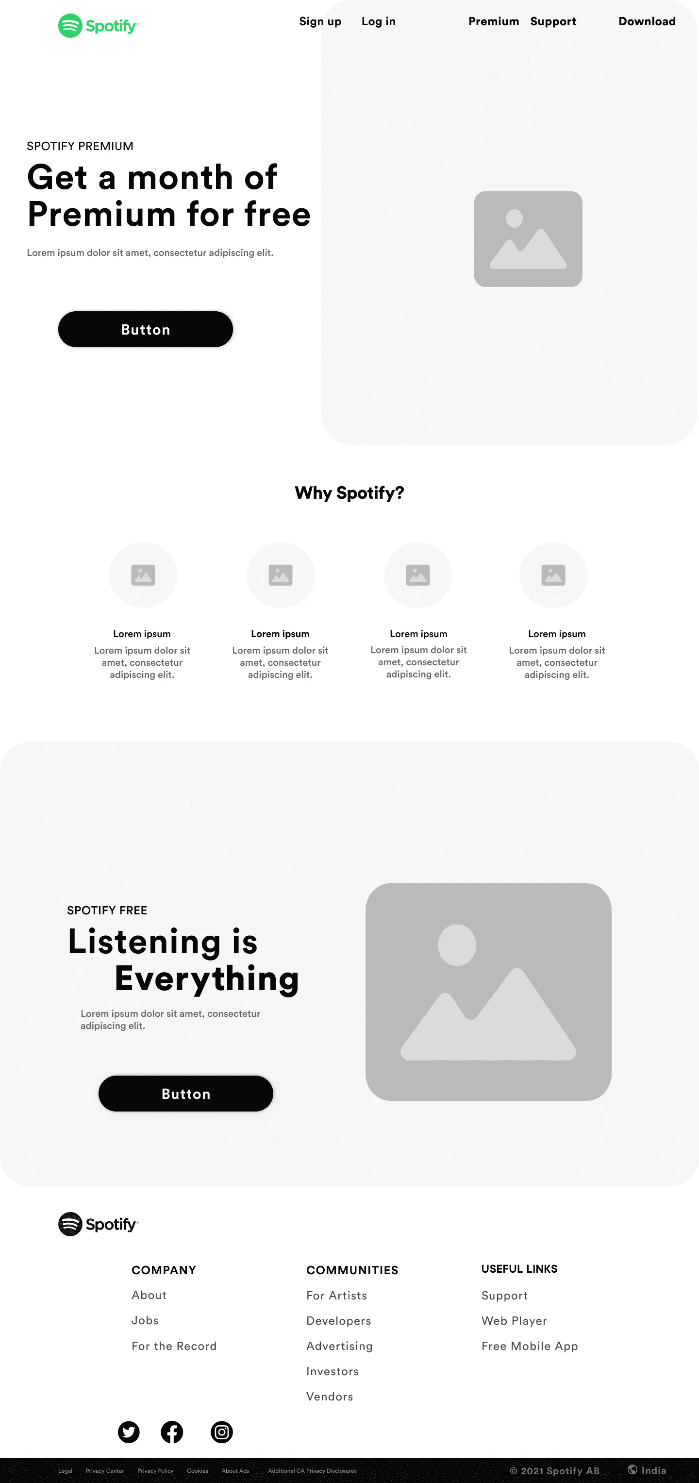
Interface with experience
These are the end result screen where UI meet UX. I wanted to reflect the brand identity of Spotify, so the users don’t get confused.
Hi Fi Wireframe
Added an ad for purchasing premium
Changed the colors to match their brand identity
Increased the size for better readability
Changes the header in such a way that it attracts more attention
Made an ad for downloading Spotify
Navigate you way throughout the site
Home
Buy premium for spotify
Premium
Get help for your problems
Support
Download and enjoy Spotify
Download
Very simple onboarding experience
Sign in
Log in to your account
Log in
Added an ad for purchasing premium
Changed the colors to match their brand identity
Increased the size for better readability
Changes the header in such a way that it attracts more attention
Made an ad for downloading Spotify
Navigate you way throughout the site
Home
Buy premium for spotify
Premium
Get help for your problems
Support
Download and enjoy Spotify
Download
Very simple onboarding experience
Sign in
Log in to your account
Log in
Prototype
Conclusion
The long process of researching, testing, and repeatedly honing my designs has led to a project I’m proud of, but still, I believe there’s a lot of room for improvement.
It's good to ask for lots of help! Having a fresh pair of eyes helped a lot with nitpicking details I glazed over
Test the final prototype with more users and make adjustments for improvement
Can help challenge the assumptions I made in my design
WHAT I LEARNED
SOME THINGS I WOULD DO DIFFERENTLY...
Solution
Redesigning the website such that it resembles the brand identity of Spotify.
02 Redesigning of home page.
What’s the cure
01 Use of brand signature colors.
Problems
After gathering data from online surveys and observation. I identified some basic element/features of the website to improve upon.
What’s wrong?
01 Use of too many colors.
02 Brand identity not visible.
03 Home page
Introduction
Spotify is one of the most popular music streaming platform that offers more than 30 million songs and has generated over 100 million active users on both desktop and mobile versions of their product.
Despite its immense success and huge user base, certain design features/elements of the website can be updated for the user to have a seamless experience
*Original
Making Spotify more musical.
Enhancing the User Experience Of the Spotify website.
Redesign, UI/UX

Timeline
October 2023
( < 1 Week )
Design Role
UI/UX Designer
Team
Individual
Wireframe
Lo Fi wireframes allow me to put my ideas into action and further develop them into Hi Fi wireframes. I try to visually represent the data gathered in research phase.
Lo Fi Wireframes
Main Page
Premium
Support
Research
Finding opportunity
To determine that the spotify website really needed a new look, i conducted some interviews to better understand the problems they were facing with the website.
Findings
All interviewees emphasized on the website not looking like spotify.
Contrary to my expectations, they were not intimidated by two many premium options.
User Research
User research is important to understand users, their needs, their pain points. It helps me to go in a correct direction for redesigning this project.
Rahul
Student
Sometimes finds it boring to navigate through the whole premium purchasing process
Would love to have an easy way to go to the premium page.

Travel enthusiast
He feels like the website should have more green to it.

Arjun
He feels like he has entered some fake website.
Designer
She does not like too many colors used on the website.
She thinks that the website needs an update

Samiksha
Journey mapping
I tried to define the journey of a potential user through the website. His expectations and areas of improvement.
Rahul
Student
Scenario
Rahul visits the website every 3 months. He sometimes finds it difficult to navigate his way through the website. He would love if navigation was made easy specifically for goring to the premium page.


Visit
Pain Points
Pain Points
Premium
Compare
Brand identity not visible.
No easy way to go to premium
Brand identity not visible.
Blue make it look like the website is some fake one
Compare all the plans that Spotify provides.
Select
Selecting the most favorable plan and purchasing premium.
Roadmap
On the basis of research I figured out a roadmap of the users. I tried to simplify as much as I could.
Journey from home page to purchasing premium
Roadmap 2
Entering the website
Navigating to the premium option
Choosing the perfect plan and making payments
Journey from home page to downloading Spotify
Roadmap 1
Entering the website
Navigating to the download option
Clicking on the download button
Design elements
I have changed some design elements of the website to make it look more modern, minimal and user-friendly.
Design elements
A limited use gradient elements makes the design look beautiful, modern and elegant.
Rounded corners give the design more minimal and modern feel.
Circular Std is the official font for Spotify. This typeface is very modern and minimalistic.
Typography
Rounded corners
Green
#1ED760
White
#FFFFFF
Black
#1B1B1B
Green, white and black are the official colors of the Spotify brand. These hues are accessible and legible
Color palette
Gradient element
Book
Medium
Bold
Black
Circular Std
Interface with experience
These are the end result screen where UI meet UX. I wanted to reflect the brand identity of Spotify, so the users don’t get confused.
Hi Fi Wireframe
Added an ad for purchasing premium
Changed the colors to match their brand identity
Increased the size for better readability
Changes the header in such a way that it attracts more attention
Made an ad for downloading Spotify
Navigate you way throughout the site
Home
Buy premium for spotify
Premium
Get help for your problems
Support
Download and enjoy Spotify
Download
Very simple onboarding experience
Sign in
Log in to your account
Log in
Conclusion
The long process of researching, testing, and repeatedly honing my designs has led to a project I’m proud of, but still, I believe there’s a lot of room for improvement.
It's good to ask for lots of help! Having a fresh pair of eyes helped a lot with nitpicking details I glazed over.
To do a more in depth research to find the real reason they they made their website the way it is.
Test the final prototype with more users and make adjustments for improvement
Can help challenge the assumptions I made in my design
What i learned
Some things i would do differently
Solution
Redesigning the website such that it resembles the brand identity of Spotify.
02 Redesigning of home page.
What’s the cure
01 Use of brand signature colors.
Problems
After gathering data from online surveys and observation. I identified some basic element/features of the website to improve upon.
What’s wrong?
01 Use of too many colors.
02 Brand identity not visible.
03 Home page
Introduction
Spotify is one of the most popular music streaming platform that offers more than 30 million songs and has generated over 100 million active users on both desktop and mobile versions of their product.
Despite its immense success and huge user base, certain design features/elements of the website can be updated for the user to have a seamless experience
*Original
Making Spotify more musical.
Enhancing the User Experience Of the Spotify website.
Redesign, UI/UX

Timeline
October 2023
( < 1 Week )
Design Role
UI/UX Designer
Team
Individual
Wireframe
Lo Fi wireframes allow me to put my ideas into action and further develop them into Hi Fi wireframes. I try to visually represent the data gathered in research phase.
Lo Fi Wireframes
Main Page
Premium
Support
Research
Finding opportunity
To determine that the spotify website really needed a new look, i conducted some interviews to better understand the problems they were facing with the website.
Findings
All interviewees emphasized on the website not looking like spotify.
Contrary to my expectations, they were not intimidated by two many premium options.
Prototype

View on Desktop/Laptop for a better experience
.Spotify
View on Desktop/Laptop for a better experience
.Spotify
View on Desktop/Laptop for a better experience
.Spotify