


Redesigning


Human Resource Management System
This case study outlines the comprehensive design journey to revamp SumHR’s interface, aligning it with its core emphasis on practice-based learning.
UI/UX Design
User testing
Research
Wireframe
High-fidelity UI
Prototype
Accessibility evaluation
Problem Statement
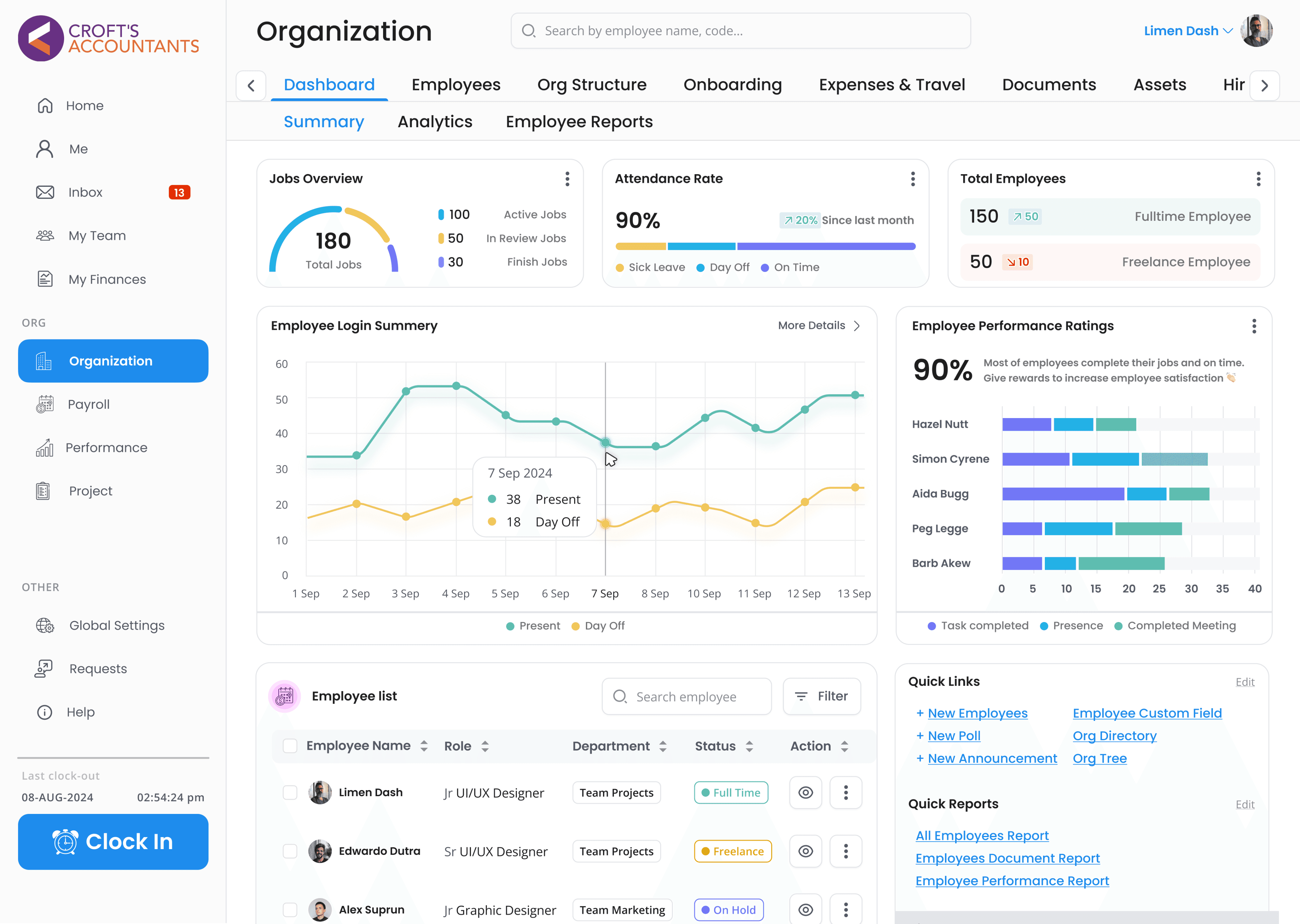
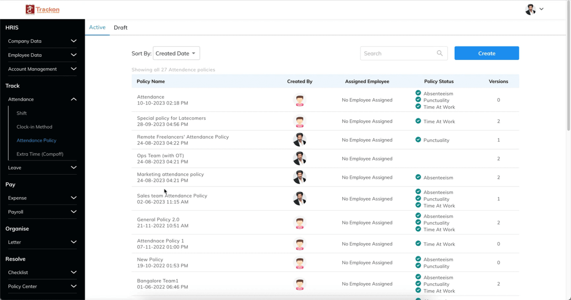
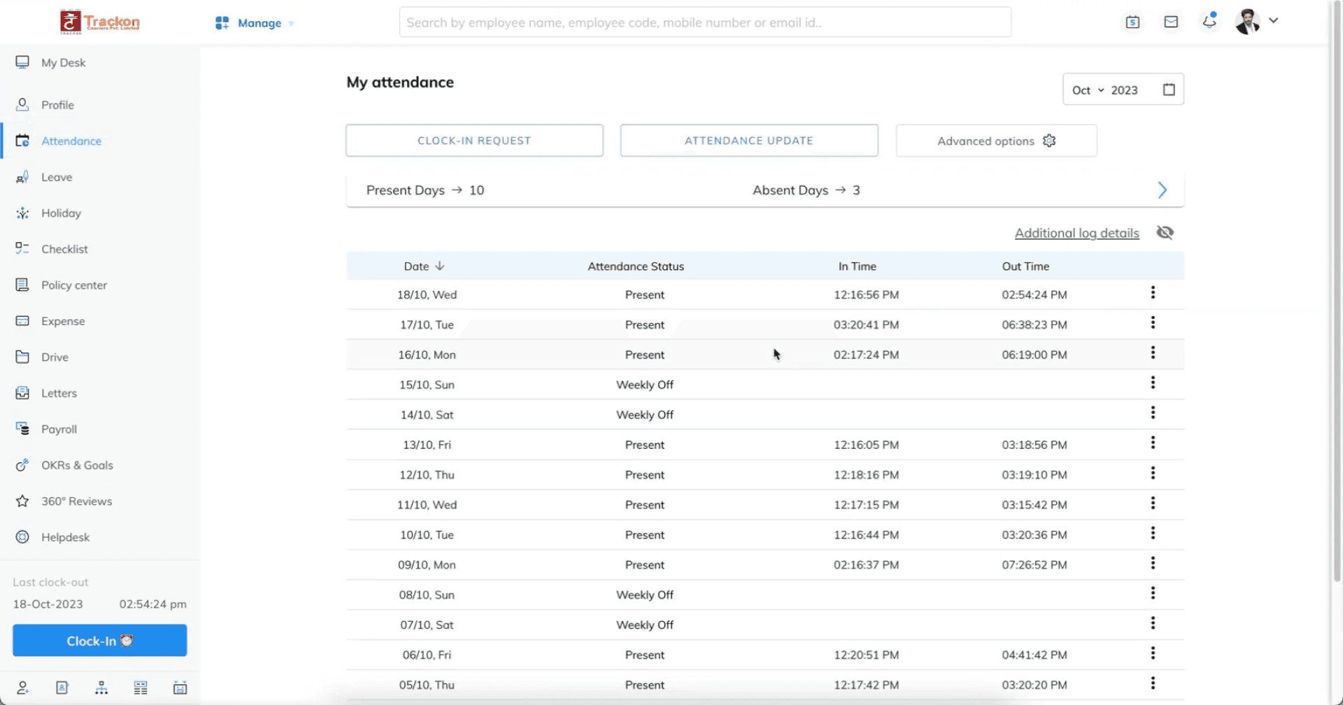
SumHR needed to update its dashboard to help organizations manage employee and company details more easily. The old design was hard to use and kept users from fully exploring its features. The goal was to redesign the dashboard to make it simpler, more efficient, and visually appealing, ensuring users could navigate and manage tasks with ease.
User Testing
I conducted user surveys to gain a deeper understanding of their preferences, needs, and challenges, aiming to enhance our application’s usability and effectiveness.
Insights
"Navigating to key features can is challenging."
"Some information on the homepage is unnecessary."
"Other software provides additional features."

Initial design
Survey
To understand the root of the problem, evaluations were conducted with current users of SumHR, potential users, and those using similar HR software.
The old design and poorly structured user experience were negatively affecting user interaction and overall engagement with the dashboard.
Very Satisfied
100%
75%
50%
25%
0%
Satisfied
Neutral
Dissatisfied
Very Dissatisfied
How satisfied are you with your current accounting software in terms of ease of use and user interface?
What features do you consider most important when choosing accounting software?
Attendance System
35%
Running Payroll
25%
Organization Details
20%
Project Management
15%
Expense Tracking
5%
Which accounting software do you use other than this?
Workday
40%
CoreHR
35%
SAP SE
15%
Paycom
10%
How often do you encounter difficulties or challenges while using your current accounting software
25%
55%
15%
5%
Often
Sometimes
Rarely
Never
Meta Insights
During the evaluation, I observed recurring patterns across several major areas, indicating consistent issues that needed attention. Identifying these trends allowed me to pinpoint the underlying causes and provided a clear direction for making targeted improvements to enhance the overall user experience.
Affinity Mapping
Design
Excessive white space reducing efficiency.
Inconsistent design elements across the platform.
Bad visual hierarchy on the homepage and attendance page.
Ux
Some homepage content is unnecessary.
Pages lack a summarized overview, requiring extra effort to find key information.
Key features are difficult to navigate.
Workflow
Accessing features is overly complex.
Competing software offers more useful features.
Accessibility
Poor color contrast
Needs improvements screen reader compatibility
I discovered what users were feeling
The design can be confusing sometimes
The platform lacks useful features.

The process takes too long
Needed help in the process
Goal
Develop an essential product for Businesses or people seeking to calculate and track emissions efficiently.
How might we...
1
How might we redesign the SymHR dashboard to make it simpler, more efficient, and visually appealing, ensuring users can navigate and manage tasks with ease?
2
How might we change the workflow in the SumHR dashboard to make it easier for users to understand
3
How might we add features to the SumHR dashboard to better meet user needs and enhance functionality
Extensive brainstorming, meetings & finding inspiration
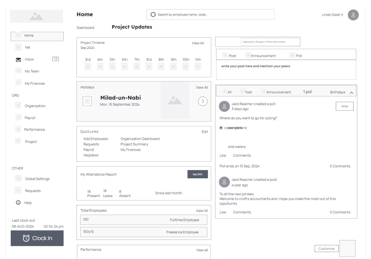
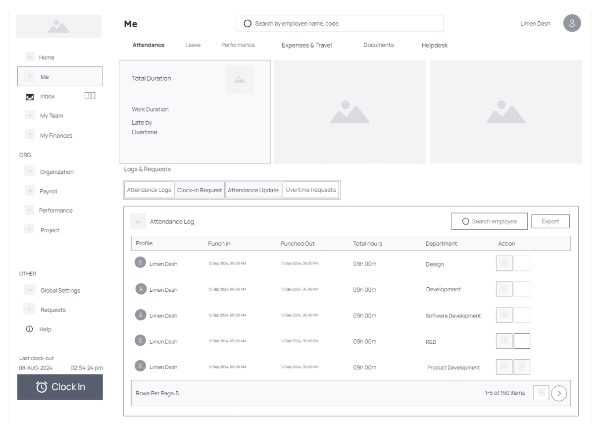
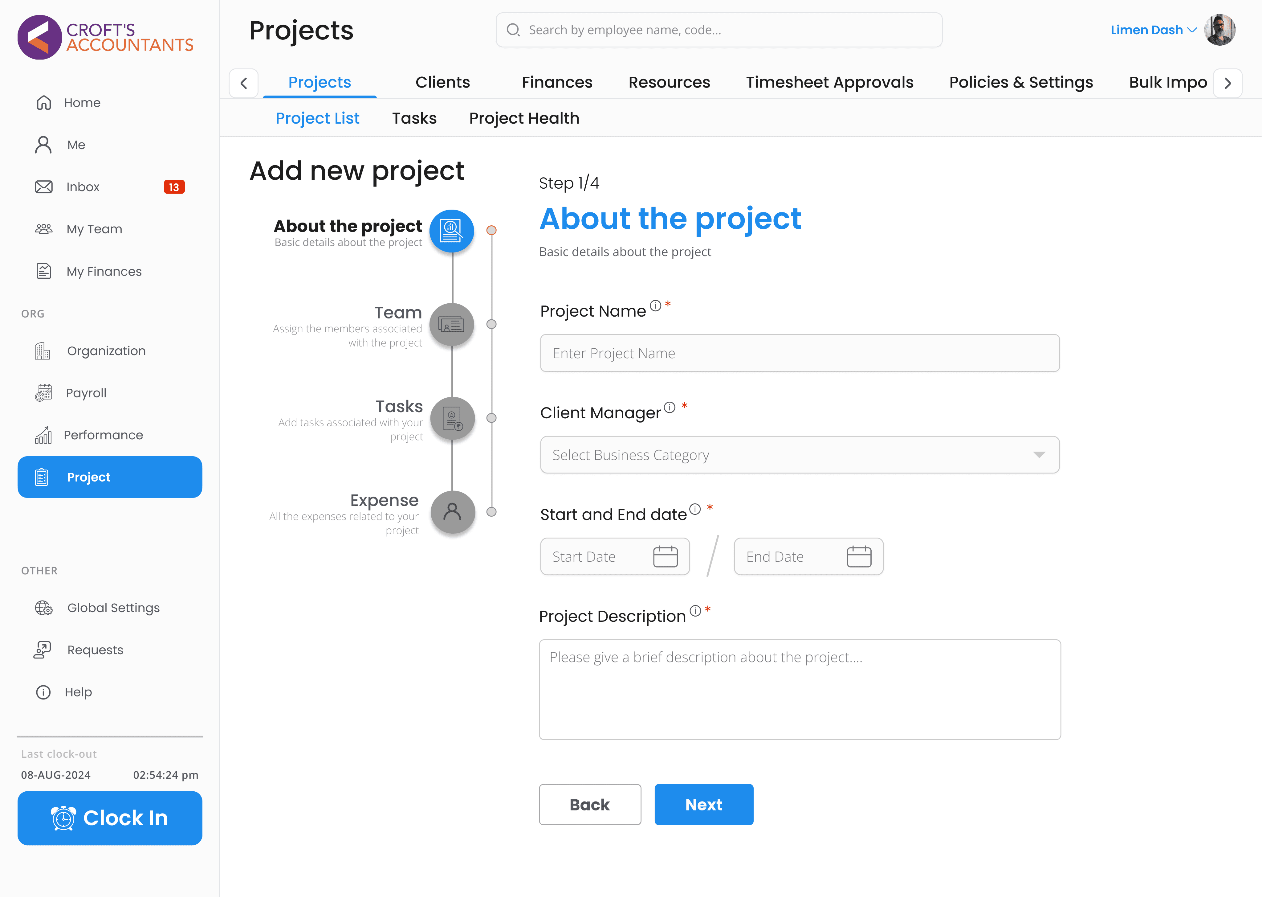
Home
Organization
Projects


Click on config mode
Select your desired setting to edit
A new window will appear

Instead of this new method, we can add a direct button on side bar or on the home pag eto all the global settings
Instead of using the word config mode, the word global settings can be use for easier understanding
Jacob’s law
users expect your site to work like other familiar sites
A completely new method for going to config mode has been introduced, which users may not be familiar with.
Click On Profile
I collect various visual references 👆🏻
New Elements
Overview of the new elements added in this design for a better user experience
Customization
Users can adjust the system to fit their needs, making it easier and more efficient for them to work.
Ability to add projects
Users can add and manage projects directly in the software, helping teams stay organized and track their work.

Organization Details
A central place where you can manage the organization details.
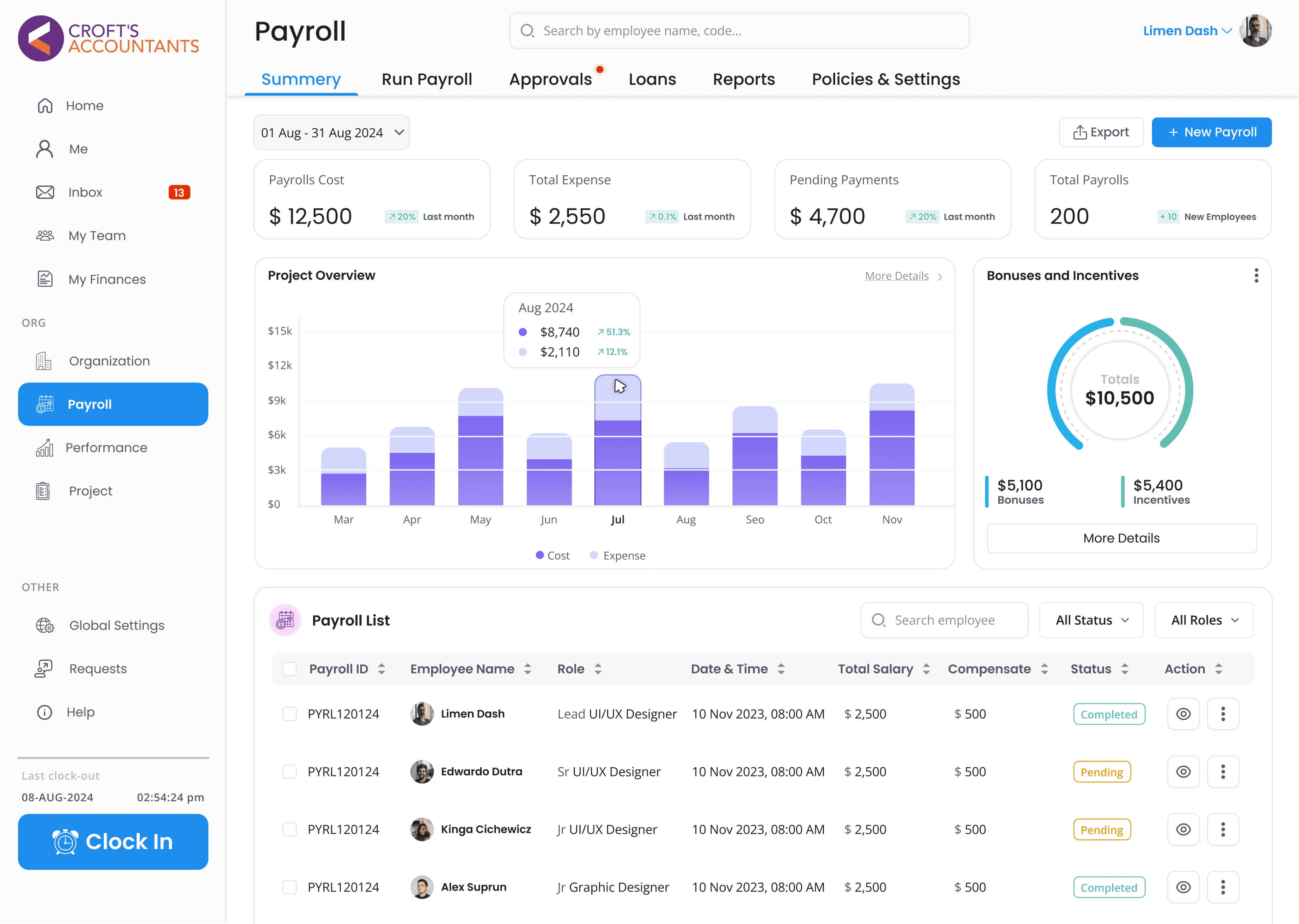
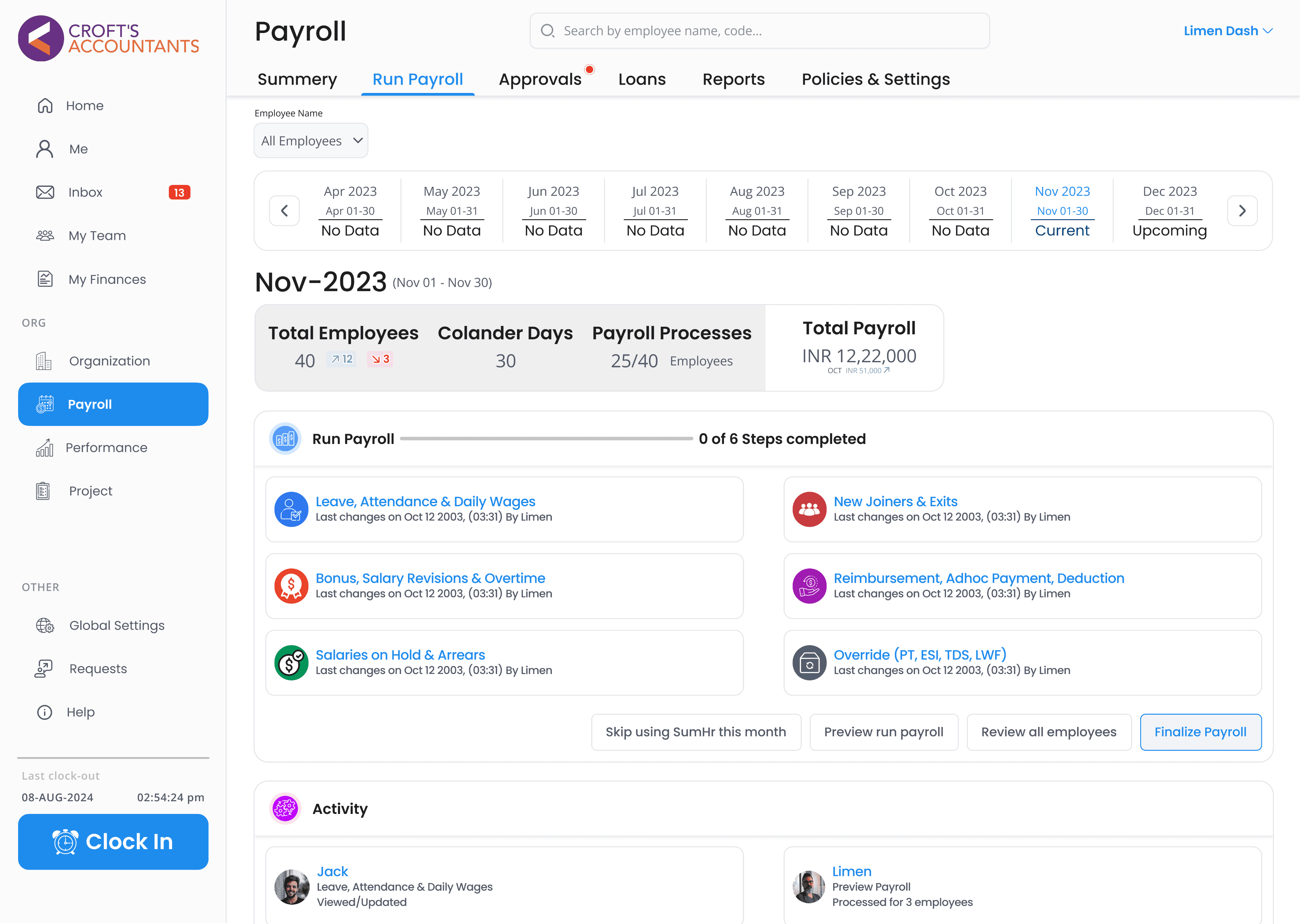
Payroll Processing
Automates salary and payment tasks, saving time and reducing mistakes in handling employee pay.

Multiple Iterations
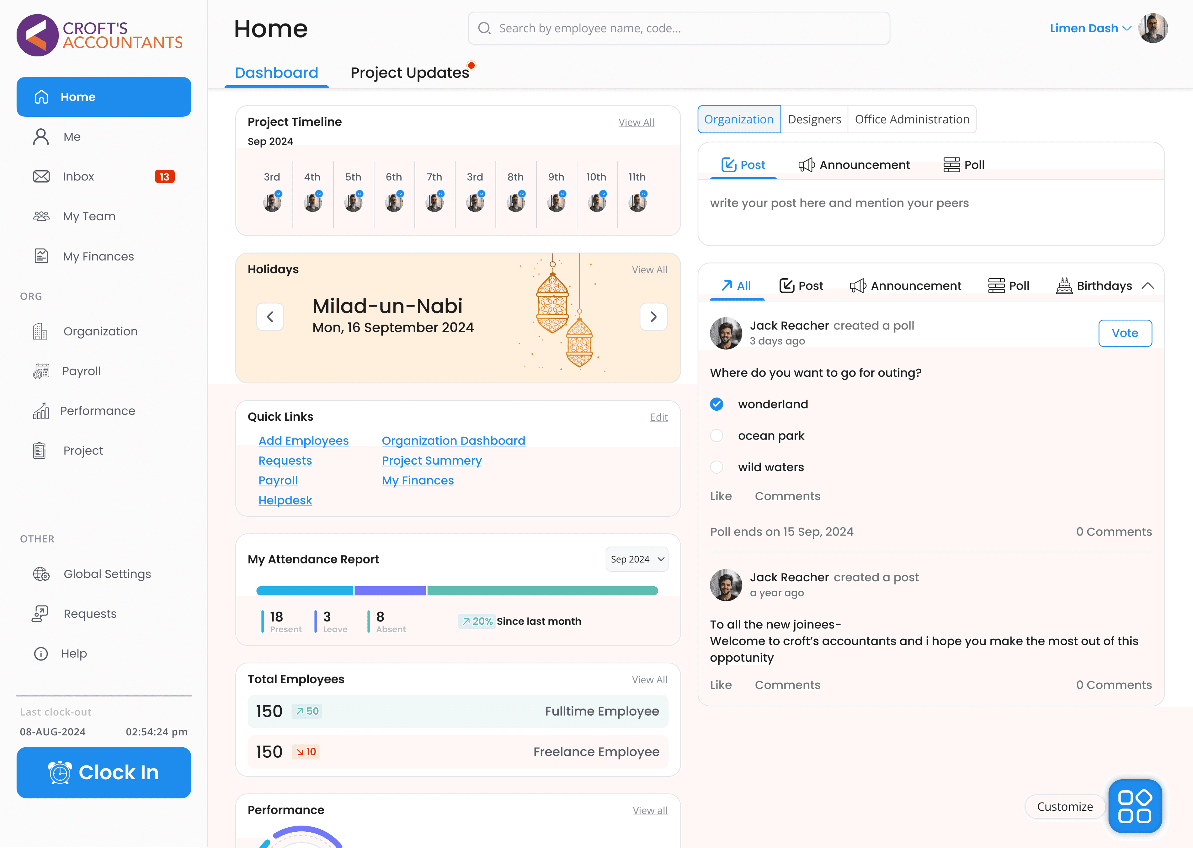
The home screen dictates a large chunk of how the user will experience the dashboard. I needed to find a way to differentiate it from the other screens while still adhering to the established themes and layouts.
Behold, the final 2 contestants out of many iterations!
Opt. 1
User-friendly sidebar
Consistent design language
Clear visual hierarchy
Ability to customize
Opt. 2
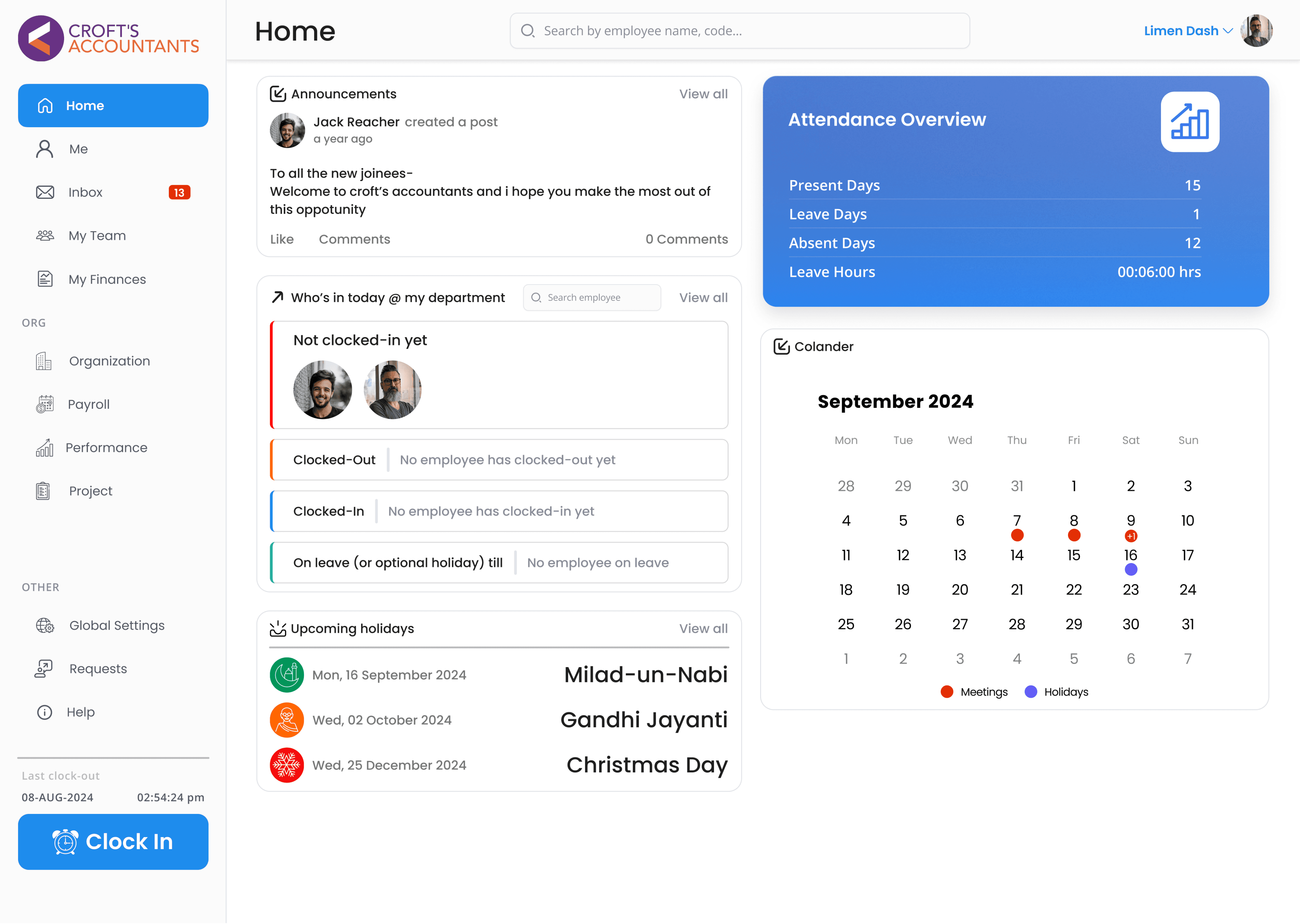
Calendar Integration
Employee Status Overview
All the screens went through multiple iterations in a similar manner


Conclusion
The long process of researching, testing, and repeatedly honing my designs has led to a project I’m proud of, but still, I believe there’s a lot of room for improvement.
What i learned
Never work on biases
I learned that relying on biases can limit creativity and problem-solving. It's essential to approach each design challenge with an open mind, considering user needs and data-driven insights instead of assumptions.
Learning to take feedback
I learned others' suggestions to improve designs and enhance the user experience.
Something i want to improve on
I'd like to work more on my research method. The sample for my initial evaluation research was quite small. While they gave me incredible insights, it definitely would have been better if I reached out to a larger audience for more diversity!